


Overview
The chart Toolbar is an element that provides the user with options to quickly access key chart options (Figure 1). To make this element visible, go to the User Interface category of the chart Properties browser, expand the UI node, and expand the Toolbar node. Then set its Enabled property to True.
You can configure the chart Toolbar element using a number of appearance properties to customize its borders, frames, and shadow offsets.
 |
| Figure 1: The chart toolbar. |
The context menu, shown in Figure 2 below, allows end users to alter their chart's appearance at runtime. To make this element visible, go to the User Interface category of the chart Properties browser, expand the UI node, and expand the ContextMenu node. Once expanded, set its Enabled property to True.
Docking And Positioning
The Toolbar also has Position, Docking, and Placement properties to set its drawing location on the chart. The Position property can be used to explicitly set the relative positions of the Toolbar. If the Toolbar is auto-positioned (Position.Auto = true), the Docking and Placement properties can be used to position the Toolbar; otherwise they have no effect.
External Toolbar
The ChartToolbar control can be dropped from the Visual Studio toolbox if you wish to further customize the position and contents of the Toolbar. All attributes from the Chart UI Toolbar are inherited.
Using The Context Menu
The context menu is a dynamic list of options that allows the end user to quickly access key chart options. When a chart element is right-clicked with the mouse, the context menu will display a list of commands that can be used to customize the corresponding chart element.
In order to use the chart ContextMenu control, go to the User Interface category of the chart Properties browser, expand the UI node, expand the ContextMenu node and set its Enabled property to True.
Adding Items To The UI
To add buttons to the toolbar, add to the Items collection of the Toolbar. To add items to the context menu, add to the Items collection of the ContextMenu. Items can be chosen from the Command collection, which contains a pre-defined list of chart functions. The order of items in the Items collection of the UI determines the order that the items will be displayed on the UI.
 |
Some commands will only be enabled if a command parameter is specified. This gives the command its proper context within the UI. For a list of command parameters, refer to the topic on Command Parameters. |
Using The Property Dialog
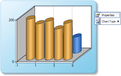
The Property dialog window lets the end user configure the charting control at runtime. In order to have this functionality, you must include the Properties window to your chart's UI. Once the Properties command has been added to the UI, end users can customize all chart properties using the Property dialog window, which is accessed through the Properties context menu item shown in Figure 2 below.
 |
|
Figure 2: The Properties menu of the charting control opens the Properties dialog window. |
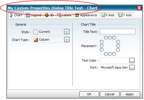
The Property Dialog displays a list of properties for a selected chart element as shown in Figure 3 below.
 |
|
Figure 3: The Property Dialog window with a custom title (shown circled in red) assigned to it. |
|
On the Appearance tab there is a Color #2 property. This property cannot be set to a transparent color or an error will occur. |
|
The PropertyDialogTitle property is only available in the Enterprise Edition of Dundas Chart for ASP.NET. |
Disabling Tabs In The Property Dialog
By default, when a chart element is clicked, all relevant tabs are shown in the Property Dialog. You can hide certain tabs in order to control the degree of flexibility that the end user has to modify chart options.
To disable tabs, an additional parameter must be specified to the show properties command. The string parameter is in the form: "DisableTabPage=N[,DisableTabPage=N2]", where N is the integer index of the page to disable.
The following is a list of available pages, and their indexes:
- Chart Generic Properties
- Legend Properties
- 3D Properties
- Data Point Labels Properties
- Appearance Properties
- X Axes Properties
- Y Axes Properties
- Error Bars
- Formulas
Example
This example demonstrates how to hide tab pages on the Property Dialog.
| Visual Basic |  Copy Code Copy Code |
|---|---|
|
|
| C# | Copy Code |
|---|---|
|
|
Properties Available Using The Property Dialog
The following properties can be altered using the Properties dialog:
| Axis Properties |
|---|
| Axis.Enabled |
| Axis.Interlaced |
| AxisX.LabelStyle.Format |
| Axis.MajorGrid.Enabled |
| Axis.Margin |
| Axis.MinorGrid.Enabled |
| Axis.Reverse |
| Axis.Title |
| Axis.TitleColor |
| Axis.TitleFont |
| Chart Properties |
|---|
| Chart.BackColor |
| Chart.BackGradientEndColor |
| Chart.BackGradientType |
| Chart.BackHatchStyle |
| Chart.BorderLineColor |
| Chart.BorderLineStyle |
| Chart.BorderLineWidth |
| Chart.Palette |
| ChartAreas Properties |
|---|
| ChartAreas.Area3DStyle.Clustered |
| ChartAreas.Area3DStyle.Enable3D |
| ChartAreas.Area3DStyle.Perspective |
| ChartAreas.Area3DStyle.PointDepth |
| ChartAreas.Area3DStyle.PointGapDepth |
| ChartAreas.Area3DStyle.RightAngleAxes |
| ChartAreas.Area3DStyle.XAngle |
| ChartAreas.Area3DStyle.YAngle |
| Legend Properties |
|---|
| Legend.Alignment |
| Legend.Docking |
| Legend.DockInsideChartArea |
| Legend.Enabled |
| Legend.LegendStyle |
| Series Properties |
|---|
| Series.Font |
| Series.FontAngle |
| Series.FontColor |
| Series.LabelFormat |
| Series.LabelStyle (Custom Attribute) |
| Series.ShowLabelAsValue |
| Series.SmartLabels.Enabled |
| Series.Type |
| Title Properties |
|---|
| Title.Alignment |
| Title.Color |
| Title.Docking |
| Title.Font |
| Title.Text |